How Safe Is My Neighborhood, Really? Building a Crime Score That Holds Up Against the Ground Truth

Everybody asks the same first question
For most of our users, the first thing they want to know about a prospective neighborhood is, ‘is it safe?’ It is also one of the hardest questions to answer honestly. A handful of companies will post an answer, but the data underneath those clean letter grades is far messier than it looks.
We built SettleSavvy’s crime score to estimate neighborhood safety as good or better than anyone else, and by every available measure we outperform the others. Our model agrees with where crime actually happens 10 to 30 percent better than the leading consumer crime score, the provider we’ll call the competitor. Similarly, it doubles the accuracy of AGS CrimeRisk, the main incumbent crime index behind much of the banking, insurance, and real estate industry, scoring 0.66 against actual crime in Los Angeles where AGS manages only 0.27. Across the board our Spearman correlation is 0.83 at the census tract level relative to our ground truth hold out sample.
The rest of this post explains how the crime data business actually works, where it breaks down, and how we know our numbers hold up.
The data landscape is messier than it looks
There is no single, clean, national, neighborhood-level crime dataset. What exists instead is a layered set of imperfect sources.
At the foundation is the FBI’s national crime data, collected since 1930 through the Uniform Crime Reporting (UCR) program. For most of that history, agencies reported simple aggregate monthly counts under the Summary Reporting System (SRS). More recently the FBI has been moving everyone to the National Incident-Based Reporting System (NIBRS), which records each individual incident along with its circumstances, such as location, time of day, and whether the case was cleared. NIBRS is far richer, but the transition was disruptive. The FBI retired SRS and required NIBRS-only submissions starting in 2021, and because thousands of agencies had not yet converted their records systems, national coverage fell sharply: agencies covering roughly 95 percent of the population reported in 2020, but only about 65 percent did in 2021 (BJS, 2022; the FBI has since gone back to accepting both formats). Either way, FBI data is reported at the agency or county level, not the neighborhood level, so on its own it cannot tell a buyer which streets are safer than others.
The second source is incident-level data published directly by police departments and assembled into research datasets such as the Crime Open Database. These are geocoded down to the block and genuinely excellent, but they cover only a few dozen large cities. The suburbs, where most Americans actually live, and rural areas are largely unobserved at the incident level.
The third source is the commercial consumer scores, the grades you see on real estate and “is it safe” sites. Because that public foundation is so thin, these products lean heavily on statistical imputation: they take the sparse data above and model neighborhood crime everywhere else. The rest of this post is about the ways that modeling goes wrong and how we improve on it.
Four ways the clean grades go wrong
The dark figure, and inconsistent definitions. A large share of crime is never reported to police (BJS, 2023), and reporting rates vary widely by offense and by community, so raw counts can reflect how much a community trusts the police as much as how often it is actually victimized. Definitions vary too: one jurisdiction’s burglary is another’s breaking and entering is another’s theft from a vehicle. A grade built on these counts is only as comparable as the underlying reporting, which is to say not very.
Missing data that is not missing at random. A separate problem is that the gaps in crime data are systematic. Imputation models generally assume missing data is missing at random, but Boylan (2019) shows that the standard methods for filling missing FBI statistics systematically understate crime, because agencies are less likely to report precisely when crime is high. The result is that imputed scores tend to be least accurate in exactly the places where accuracy matters most.
Thin data, in two senses. The products are built on a thin foundation, and not only in their predictors. On the prediction side, AGS models each crime type using “about 100 socioeconomic characteristics,” mostly demographic and economic variables like age, income, education, and family structure; the competitor publishes no feature count at all, describing its method only in general terms as machine learning that fills coverage gaps and corrects for police reporting errors. Less often acknowledged is that the ground truth used to fit and check these models is just as scarce. Block-level incident data detailed enough to anchor a neighborhood model exists for only a small number of cities; in its 2024 documentation, AGS lists eight that meet its bar (New York, Chicago, Boston, Philadelphia, Baltimore, Seattle, Austin, and Mesa), and notes it adds more with each release. A model whose fine-grained ground truth comes from a handful of cities has little basis for getting the rest of the country right.
A denominator that breaks downtowns. A safety score is a rate: incidents divided by population. The popular consumer grades divide by residential population only, which distorts any place where the daytime population differs from the number of people who sleep there. A downtown tract with a few thousand residents and tens of thousands of daily workers and visitors shows a frightening rate when its crime is divided by residents alone, even though, per person actually present, it may be among the safest places in the city. The competitor concedes the problem on its own pages, cautioning that “high-traffic areas like shopping districts artificially inflate per-capita rates with few resident populations.” Same crimes, opposite conclusion, decided entirely by the denominator.
None of this is news to the researchers who study crime measurement, who have been skeptical of the commercial indices for years. Nau et al. (2019) tested AGS against actual LAPD crime across about 1,100 census tracts, treating an index as trustworthy only if it correlated above a modest threshold, a Spearman correlation of 0.3, with real crime. Several of AGS’s individual crime indices cleared that bar, but the one number a homebuyer actually sees, the overall crime index, did not. It correlated just 0.27 with real Los Angeles crime, and the authors warned it “should be used with extreme care.”
What we built
Our approach starts from one decision: anchor every neighborhood to its county’s observed crime total, then distribute that total across neighborhoods with a model. We correct the county totals for the NIBRS coverage collapse so the anchor reflects what actually happened, and then let the model decide where, within each county, crime concentrates.
That model is trained on far more than a hundred demographic variables. We assembled thousands of environmental and activity signals for each neighborhood: home price trends, daytime employment by sector, retail and transit access, building density and land cover, nighttime lights, the structure of roads and intersections, proximity to alcohol, cash, and late-night venues, and much more. A place’s crime tends to leave a fingerprint in features like these, and the breadth of them is what lets the model generalize to neighborhoods it has never seen.
We also gave ourselves far more ground truth to work with than the public datasets offer. Starting from the Crime Open Database, we added a large volume of incident data pulled and cleaned directly from individual county and municipal sources, building geocoded crime records for 111 counties, including the suburban middle that most datasets skip entirely. That gives the model much more real crime to learn from and, just as important, much more to be tested against.
We also count the right people. Rather than dividing crime by residents alone, we measure it against the people actually present, residents plus workers, using Census LEHD jobs data. That will not capture every tourist or shopper, but it is a far closer approximation of the person-hours genuinely exposed to risk, and it keeps job-dense areas from being mislabeled as dangerous simply because few people sleep there.
And we deal with the reporting problems at the source rather than passing them downstream. Instead of imputing on the assumption that missing crime is missing at random, we use causal econometric methods that account for the fact that reporting falls as crime rises. We also restrict the score to consistently reported, victim-salient offenses (homicide, robbery, burglary, and motor vehicle theft), so a grade means the same thing in Houston as it does in suburban Maryland. These categories are reported uniformly across the country for durable reasons: some of it reflects deep cultural agreement about what a homicide is, and much of it reflects insurance requirements, since nothing produces consistent reporting like a uniform financial incentive.
Our published model never uses protected-class characteristics, such as race, ethnicity, sex, national origin, family status, or disability, as inputs. The model learns from the built environment and behavior of a place, not from the race or background of the people who live there. This exclusion costs us essentially nothing: in an unreleased version we added these variables to see whether they meaningfully improved accuracy, and they did not. With a feature set as rich as SettleSavvy has, they add essentially no additional signal.
How we know it holds up
How we measure it
Every accuracy figure in this post is a Spearman correlation: a simple measure of how closely a model’s ranking of neighborhoods, from safest to most dangerous, matches the real ranking from actual crime. It runs from 0, no better than guessing, to 1, a perfect match.
To earn that score honestly, we hide entire counties from the model during training, then ask it to rank neighborhoods in places it has never seen, and we score each held-out county exactly once. Because America is roughly 15 percent urban, 51 percent suburban, and 34 percent rural, we weight the result to that real mix rather than to the dense cities where every product looks good. Across all areas, SettleSavvy scores a Spearman of 0.83, rising above 0.9 in cities. The maps and table below zoom in further, to how well it ranks neighborhoods within a single metro.
One detail makes the comparisons that follow conservative rather than generous: both AGS and the competitor may well use Los Angeles and San Diego data directly in their own products, while our model never saw either county. Any edge that gives them works in their favor, and we still come out ahead.
San Diego
We start in San Diego, a metro a large share of our users are actively weighing a move to. It also lets us put SettleSavvy up against the competitor’s finest data, the census-block-group grades behind its interactive map.
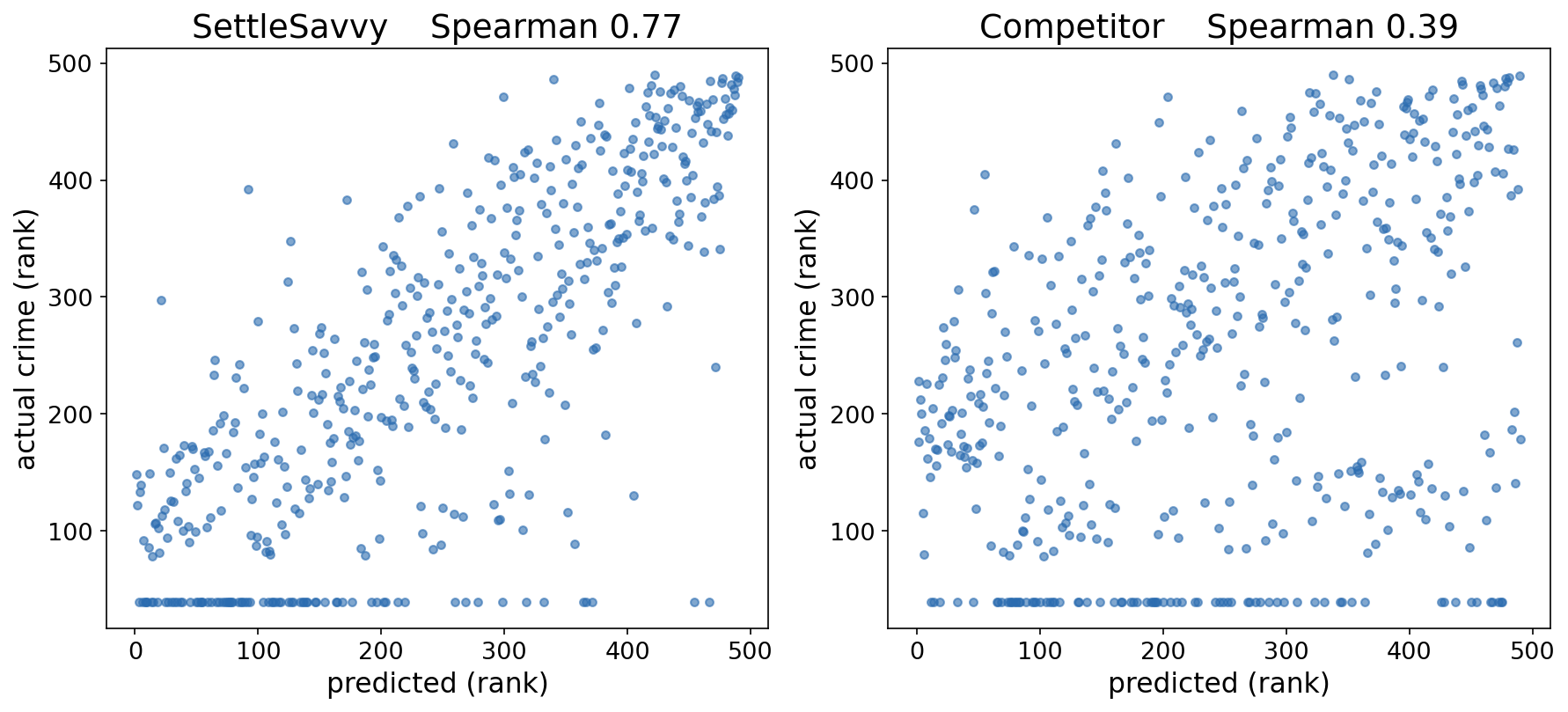
Here are the same San Diego neighborhoods three ways: where crime was actually reported (SDPD incidents), what SettleSavvy predicted for a county its model had never seen, and the competitor’s own block-group data. Green is safer and red is more dangerous. SettleSavvy lights up where the truth does, while the competitor only roughly tracks it.
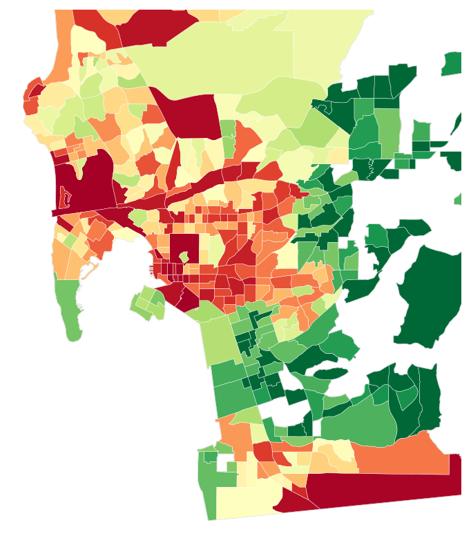
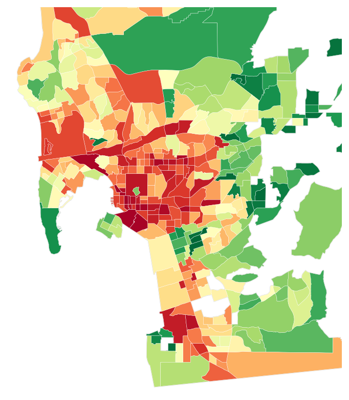
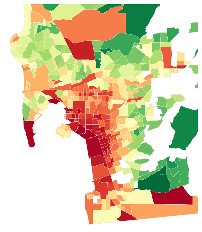

The scatter plot makes the gap concrete. Each dot is a neighborhood, and the tighter the dots hug the diagonal, the better the prediction. SettleSavvy holds close to actual crime, a Spearman of 0.77, while the competitor’s cloud is far looser, at 0.39, roughly half the agreement on the same neighborhoods.
We ran this same head-to-head against the competitor in several metros and we come out ahead every time. While the margin of victory isn’t always 30 points, we’re confident in saying our data is as good or better than anything else out there.
AGS and Los Angeles
For a second, tougher benchmark we turn to AGS and Los Angeles. Independent researchers thoroughly evaluated AGS against actual reported crime across about 1,100 Los Angeles neighborhoods (Nau et al., 2019). That gives us a published, peer-reviewed yardstick: we apply their exact methodology and simply substitute our own predictions. Their own verdict on the AGS overall index was blunt, that it should be ‘used with extreme care’. The researchers set a modest bar for a usable index: a Spearman correlation above 0.3 with actual crime. AGS’s overall index came in at 0.27, below even that bar. Ours came in at 0.66, more than double it, and higher than AGS’s best-correlating single category (robbery, at 0.60). LA is a genuinely tough city to predict, but we clear the researchers’ own adequacy bar comfortably, where AGS falls short.
Measured against ground truth, SettleSavvy comes out ahead in both cities against both incumbents.
The bottom line
Predicting crime at the neighborhood level is hard, and the existing products are real attempts at a hard problem. Measured against what actually happened, in places our model had never seen, we do it more accurately than anything else available.
But even a perfect crime score is only one part of choosing where to live. For everything that sits between a safety estimate and the real texture of a neighborhood, SettleSavvy pairs the crime score with dozens of other factors, from school quality and religious and community activity to income, commute times, and home price trends, so you can weigh what actually matters to you.
Get started finding your dream neighborhood at settlesavvy.ai.
Sources
- Nau, C., et al. (2019). “A commercially available crime index may be a reliable alternative to actual census-tract crime in an urban area.” Preventive Medicine Reports 17: 100996. link
- Boylan, R. T. (2019). “Imputation methods make crime studies suspect: Detecting biases via regression discontinuity.” Rice University. link
- Bureau of Justice Statistics (2023). Criminal Victimization, 2022. link
- Bureau of Justice Statistics (2022). National Incident-Based Reporting System (NIBRS) participation. link
- Applied Geographic Solutions (2024). CrimeRisk methodology. link