Are Crime Maps Accurate? What Movers Should Trust Before Choosing
You found a house you like. Then you pulled up a crime map, saw a letter grade sitting somewhere in the middle, and stopped. The listing photos said one thing. The color on the map said something else. Now you are trying to figure out which one deserves your down payment, and nobody has explained what that grade is actually built from.
That hesitation is fair. Are crime maps accurate? They are useful, and they are also incomplete. Those two things are true at the same time. A crime map can tell you something real about a place. It cannot tell you everything. It was never designed to be the final word on where you should live.
In this guide, you will discover what a crime map actually measures, why two tools can grade the same street differently, which gaps distort the picture, and how to read safety data as one input instead of a verdict.
Whether you are a military family with 60 days on the clock or a first-time buyer stretching a budget, the goal here is to help you weigh this data against your own priorities, not hand you someone else’s ranking.
What a Crime Map Actually Measures
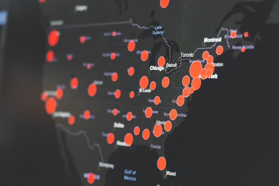
A crime map shows where recorded or estimated criminal activity sits on a geographic area. It does not measure how safe you personally will feel walking home at 9 p.m. Those are different questions. The gap between them causes most of the confusion movers run into.
Most crime maps pull from local police records, federal reporting programs, or a statistical model built on top of both. The output might be raw dots, a color-coded area, or a single score from A to F. Each format compresses a huge amount of messy information into something quick to read.
That compression is the whole point. It is also the whole problem. Once you know what got compressed, you can read the map with far more confidence.
Reported Incidents, Modeled Estimates, and Crime Scores
There are three different things people call “crime data,” and they behave very differently.
- Reported incidents: actual events logged by a police department, often with a date and an approximate location. Closest to the ground truth, but only covers crimes that were reported and recorded.
- Modeled estimates: figures calculated for areas where direct reporting is thin or missing. Models fill gaps using patterns from similar areas, which is reasonable for wide comparisons and shakier at the block level.
- Crime scores or grades: a single letter or number built by combining categories, weighting them, and comparing an area against a benchmark. Fast to read, but the weighting is a judgment call made by whoever built the tool.
A score is an interpretation, not a measurement. Two companies can use identical underlying records and still publish different grades because they weighted violent crime and property crime differently.
That distinction matters most when you are comparing two neighborhoods that look close on paper.
Violent Crime and Property Crime Are Different Signals
Violent crime and property crime often behave nothing alike, even inside the same ZIP code. An area with busy retail corridors may show elevated theft while violent incidents stay low. A quiet residential pocket can show the opposite pattern.
When a tool blends both into one grade, that difference disappears. You end up with a C where the honest answer might be “low violent crime, high car break-ins near the parking structures.”
This is where mover profiles diverge sharply. A retiree relocating for walkability may care intensely about violent crime rates along the routes they walk daily and shrug at package theft. A first-time buyer parking on the street may feel the opposite way, because a broken window and a stolen catalytic converter hit a tight budget hard.
Neither reading is wrong. They are just different priorities producing different conclusions from the same map.
How Murder, Robbery, Theft, and Arson Categories Differ
Crime categories are not interchangeable. The rare ones distort small-area statistics the most. Murder is thankfully uncommon in most neighborhoods, so a single incident can swing a small area’s rate dramatically for a full year.
Robbery involves force or threat and often clusters near transit stops, ATMs, and commercial strips rather than residential streets. Theft is the highest-volume category almost everywhere, which means it usually drives the raw number you see. Arson is rare and frequently tied to vacant property conditions rather than general street safety.
The federal government tracks these categories through two separate systems. The FBI Uniform Crime Reporting program has been the backbone of national crime statistics since 1930. Local agencies submit to it voluntarily. This sets up the next issue entirely.
Why Different Tools Show Different Neighborhood Results
Two crime maps can show the same block as safe and risky at the same time. That is not necessarily a sign that one is lying. It usually means they pulled from different sources, drew different boundaries, or covered different time windows.
Nothing forces crime mapping tools to standardize. Each one makes its own choices. Those choices stack up into visibly different pictures of the same street.
Once you know which choices they made, disagreement becomes informative instead of frustrating.
Data Sources and Participation From Police Departments
Not every police department reports the same way, and some report late or partially. The FBI has been transitioning agencies to the National Incident-Based Reporting System (NIBRS), a more detailed standard that a growing share of agencies now use. Participation has improved over time, but coverage still varies by agency.
That variation ripples straight into consumer tools. A mapping product relying on direct department feeds will look different from one relying on federal aggregates or its own model.
Some departments publish detailed open data portals with incident-level records. Others release quarterly summaries. A neighborhood served by a department with thin public reporting can look artificially quiet, not because less happens there, but because less gets published.
Map Boundaries, Time Periods, and Category Definitions
Boundaries drive more disagreement than most people expect. One tool may score by census tract, another by ZIP code, and another by a named neighborhood that residents recognize but no agency officially defines.
ZIP codes are especially messy. They were built for mail delivery, not community analysis. A single ZIP can cover a walkable historic district and a stretch of highway frontage.
Time periods matter just as much:
- A map showing the last 12 months reacts quickly to change and to random noise.
- A map showing a five-year average smooths out noise and hides recent improvement or decline.
- A map that has not refreshed since last year may be describing a place that no longer exists.
Category definitions add one more layer. If one tool counts attempted burglary and another counts only completed burglary, the totals will never match.
Dot Maps, Heat Maps, and Interactive Maps Can Shape Perception
Visual design changes how dangerous a place feels, independent of the numbers. A dot map with 400 individual markers looks alarming even when those dots represent minor property incidents spread across a year.
Heat maps do the opposite kind of distortion. They smooth data into blobs. A single hotspot can appear to bleed across three streets that had nothing happen on them.
Interactive maps that let you zoom in create a false sense of precision. Many incident locations are deliberately offset to the block or intersection level to protect victim privacy. A pin sitting on a specific house rarely means what it appears to mean.
Reading the visual honestly gets you partway. The bigger issue is what never made it onto the map at all.
The Gaps That Can Distort a Safety Picture
Every crime map has holes in it. The holes are systematic rather than random. Knowing where they sit keeps you from over-trusting a clean-looking grade.
The three biggest gaps are underreporting, geographic averaging, and jurisdiction boundaries. None of them are hidden secrets. They are just rarely explained to the person staring at a letter grade before an offer deadline.
Underreporting and Reporting Delays
Crime maps only know about crimes that someone reported and an agency recorded. A meaningful share of incidents never get reported at all. That share varies by crime type and by community trust in local police.
The Department of Justice runs a separate victimization survey precisely because reported figures alone do not capture the full picture. This is a limitation the FBI addresses directly in its guidance on the nation’s two crime measures. Researchers have documented how records landing in the wrong system can create significant underreporting of certain offenses.
Reporting lag adds a second delay. Many datasets refresh monthly or quarterly. Federal aggregates run further behind. If a neighborhood turned a corner eight months ago, the map may not know yet.
Why a Citywide Number Cannot Describe Every Block
City-level crime statistics are averages. Averages hide the range. A city can sit in the middle of national comparisons while containing neighborhoods on both ends of the spectrum.
This is exactly what trips up movers who research a metro instead of a neighborhood. “Safest cities” lists compare city averages against each other. This tells you almost nothing about the four blocks you are actually considering buying.
Military families feel this most acutely. Permanent Change of Station (PCS) timelines rarely allow multiple scouting trips. A family may screen the metro, pick a general area near base, and discover the real variation only after signing. Neighborhood-level data closes that gap before the lease does. Deeper guidance on that process lives in this walkthrough of how to research a neighborhood before you commit.
How Jurisdictional Boundaries Create Incomplete Comparisons
City limits and lived geography rarely match. A metro area can span a dozen police jurisdictions, each with its own reporting standards, staffing levels, and data practices.
That creates artificial cliffs on a map. Cross one street into an unincorporated county area, and the data source changes entirely. Sometimes this produces a sharp color shift that reflects reporting differences rather than actual conditions.
Population denominators cause similar trouble. A downtown district with a small residential population but heavy daytime foot traffic will show a high per-resident crime rate. The formula counts incidents against people who sleep there, not people who pass through.
Knowing all of this does not mean throwing the map out. It means using it differently.
How Movers Can Interpret Safety Data More Carefully
Treat a crime map like a weather forecast, not a diagnosis. It tells you the general pattern and the odds. It gets less precise the smaller the area and the shorter the window you zoom into.
Used that way, crime data is genuinely valuable. Used as a single pass-fail gate, it will steer you wrong in both directions. It can rule out a good fit or green-light a bad one.
Are Crime Maps Accurate Enough to Guide a Move?
They are accurate enough to narrow a list. They are not accurate enough to finalize one.
For wide comparisons across a metro, crime maps do real work. They surface patterns you would never spot from listing photos or a weekend visit. They flag areas worth a closer look in either direction.
At the individual address level, precision breaks down. Offset locations, small sample sizes, boundary mismatches, and reporting lag all compound. A grade difference between two adjacent areas may be well within the noise of the underlying data.
So use the map to build a shortlist of five or six areas. Do not use it to eliminate an area you have never visited.
Compare Trends and Categories Rather Than One Overall Grade
A single grade compresses too much. Break it apart before you draw conclusions.
Ask these questions of any crime map you use:
- What is the direction over time? Three years of decline tell you more than one year of level.
- Which categories drive the number? Property-heavy and violence-heavy areas call for completely different decisions.
- What geography is this scored on? Census tract, ZIP code, or a custom boundary changes the meaning.
- How current is it? Check the update date before you weigh it heavily.
- What is the population base? Commercial districts skew per-resident rates upward.
For a deeper walkthrough of reading these layers together, this guide to using crime mapping data covers the mechanics in more detail.
Verify What You See Through Local Research and Neighborhood Visits
Data narrows the field. Direct observation confirms it. Visit your shortlist at more than one time of day. Ideally, a weekday evening and a weekend morning.
Look for things no dataset captures: whether porches are used, whether the sidewalks have people on them after dinner, how well-lit the walk from a parking spot to a front door actually is. Many departments hold community meetings that are open to the public, and local officers will usually answer direct questions about a specific block.
Talk to two or three people who live there. Ask what they wish they had known before moving in. That single question surfaces more useful information than an hour of scrolling.
Weigh Safety Alongside Commute, Schools, Walkability, and Cost
Safety almost never gets decided in isolation. It gets traded against commute time, housing cost, school assignment, and how much of your life you want to spend in a car.
A remote worker has more room to trade commuting for other priorities. The daily drive is not part of the equation. A family with two school-age kids may accept a longer commute to land in a specific attendance zone. A retiree may rank walkable errands and healthcare proximity above square footage entirely.
Those trade-offs are real. No single map can resolve them. Looking at safety data next to school performance information and cost figures for the same areas gets you far closer to an actual decision.
The next step is putting all of those layers on one screen.
Move From a Map Score to a More Complete Neighborhood Decision
A crime score is one layer. A decision needs several layers stacked on the same geography, weighted by what you personally value.
Metros that show up constantly in citywide safety comparisons are exactly the ones where those comparisons mislead. A single overall figure flattens enormous internal variation, and geography, commute corridors, and local reporting shape daily life more than any headline number suggests.
The honest answer in every one of those metros is the same: the citywide number is not the neighborhood number.
Why Safety Trade-Offs Look Different for Every Household
Two households can look at identical data and reasonably reach opposite conclusions. The variable is not the data. It is what each household is protecting.
A first-time buyer stretching to reach a down payment may accept a higher property crime rate in exchange for a price point that works. They may spend a few hundred dollars on lighting and a garage. A military family with young kids may hold safety as a hard floor and flex on square footage and commute instead.
A retiree relocating alone may weigh street lighting, sidewalk condition, and distance to a hospital more heavily than any composite grade. None of these people are misreading the map. They are applying different weights. That is what a real decision requires.
Use Neighborhood-Level Information to Compare Your Priorities
Once you move from city to neighborhood, the comparison gets useful. Pull the same set of factors for every area on your shortlist so you are comparing like with like.
Worth assembling for each candidate area:
- Crime patterns by category, with the trend over several years
- School assignment and performance data for the specific address, not the district average
- Realistic commute time to your actual work location, driven at the hour you would drive it
- Housing cost per square foot and what your budget buys in that area
- Walkability to groceries, parks, and daily errands
- Flood risk and other environmental factors tied to the parcel
Neighborhood-level data makes this practical. Comparing safety area by area, rather than metro against metro, gives you the within-city range that a citywide grade erases.
Build Your Personalized Neighborhood Picture Before You Choose
The last step is weighting. A shared spreadsheet of factors is only half useful if every factor counts the same. They never do in real life.
Decide which two or three factors are non-negotiable and which ones you will trade. Then apply those weights consistently across every area you are considering. Do this instead of falling for whichever neighborhood you happened to visit on a sunny afternoon.
An interactive map that lets you set your own factor weights makes this far less painful than doing it by hand. Seeing safety, commute, and cost layers side by side on one screen turns a pile of separate browser tabs into a single readable picture.
Frequently Asked Questions
How reliable are neighborhood crime maps when choosing where to buy a home?
They are reliable for spotting broad patterns and narrowing a shortlist across a metro. They become less reliable at the individual address level. Offset locations, small sample sizes, and reporting lag reduce precision. Use them to decide where to look more closely, not to make a final call.
Why do different crime maps show different safety levels for the same area?
Tools use different data sources, geographic boundaries, time windows, and category definitions. One may score by census tract, while another uses ZIP code. Each weighs violent versus property crime in its own way. Different methods produce different grades from similar underlying records.
How often is crime map data updated?
It varies widely by tool and by police department. Some agencies publish incident data daily or weekly. Others release quarterly summaries, and federal aggregates run further behind. Always check the update date on a map before you weigh it heavily in a decision.
Can a crime map show whether a neighborhood is safe near a specific address?
Not with real precision. Many incident locations are deliberately offset to the block or intersection level to protect privacy. A pin near a house does not indicate what happened at that house. Pair the map with an in-person visit at different times of day.
What types of crimes are included in online crime maps?
Most include violent categories such as murder, robbery, and assault, plus property categories such as burglary, theft, vehicle theft, and arson. Coverage depends on what the local agency reports and how the tool defines each category. Check whether attempted offenses are counted. That changes totals.
What should home buyers look at beyond crime rates?
Look at commute time to your actual workplace, school assignment for the specific address, housing cost per square foot, walkability, and environmental risks like flooding. Safety data answers one question well and leaves the rest untouched. The right area is the one that fits your full set of priorities.
Reading the Map Without Letting It Decide for You
Crime maps deserve a seat at the table. They just do not deserve the last word. What they give you is a pattern, a starting point, and a set of areas worth visiting in person before you commit to anything.
What they cannot give you is the weighting. Only you know whether a shorter commute beats a bigger yard. Only you know whether a hard safety floor matters more than square footage. That part is personal. It is the part that determines whether you are happy on that block in five years.
If you are ready to see all of your priorities on one map instead of juggling a dozen browser tabs, you can build a free personalized neighborhood map with SettleSavvy and compare areas by what actually matters to you. Prefer to talk it through first? A Savvy Consultant can walk you through the trade-offs at no cost. Book a free consultation and bring your questions.





One Comment